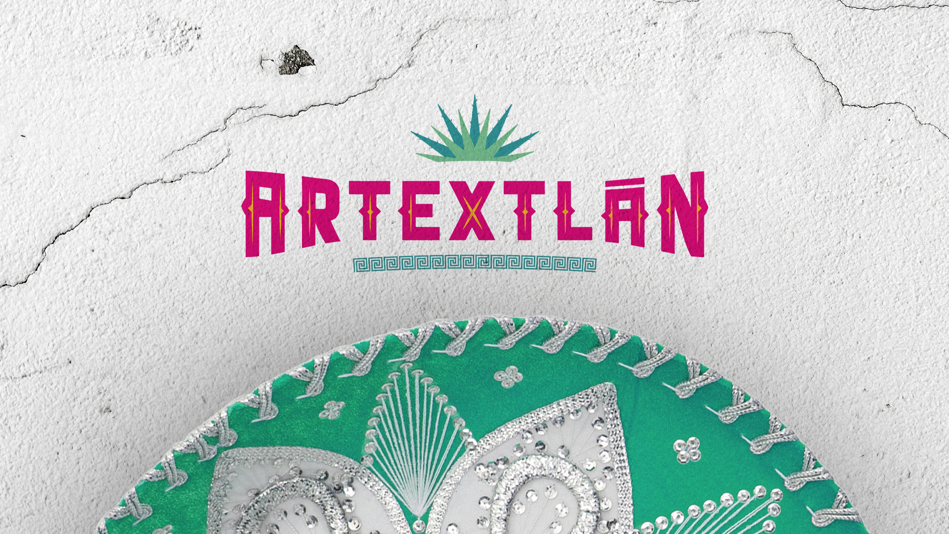
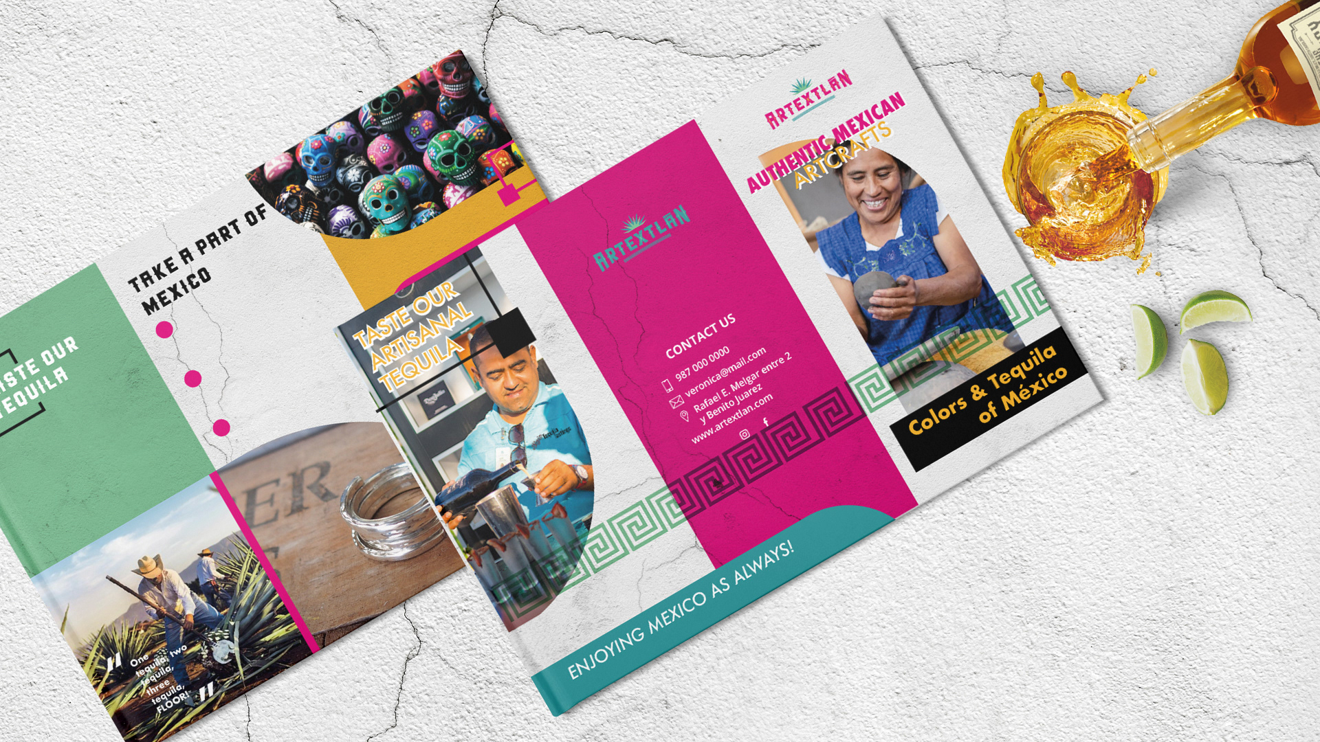
Artextlan
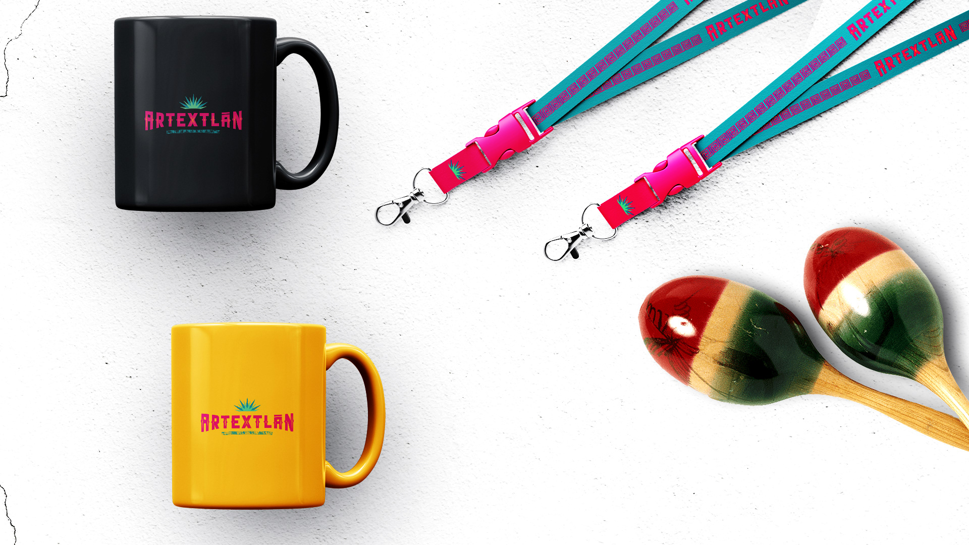
It was born from the union of the words "ART" (art in Spanish), "EX" (Mexico) and TLAN (suffix of the Nahuatl language, which means place of. Place. Site.. A typeface inspired by papel picado was chosen Mexican that is traditionally used to decorate cultural and sometimes social festivities. For the typography, the Mexican pink color was used, accented with a shade of mustard yellow located in the center of each letter interpreting in this way, the cuts of the papel picado.
It was born from the union of the words "ART" (art in Spanish), "EX" (Mexico) and TLAN (suffix of the Nahuatl language, which means place of. Place. Site.. A typeface inspired by papel picado was chosen Mexican that is traditionally used to decorate cultural and sometimes social festivities. For the typography, the Mexican pink color was used, accented with a shade of mustard yellow located in the center of each letter interpreting in this way, the cuts of the papel picado.
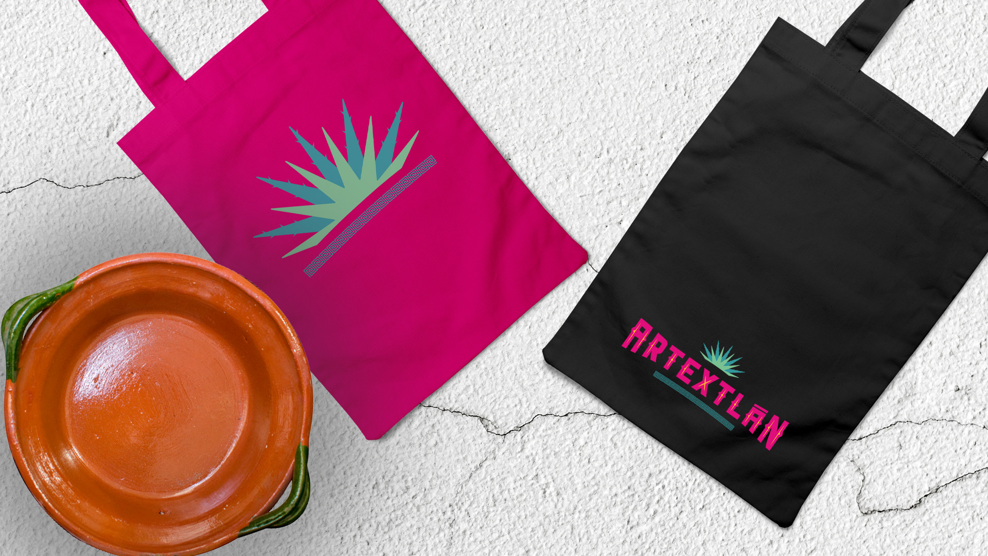
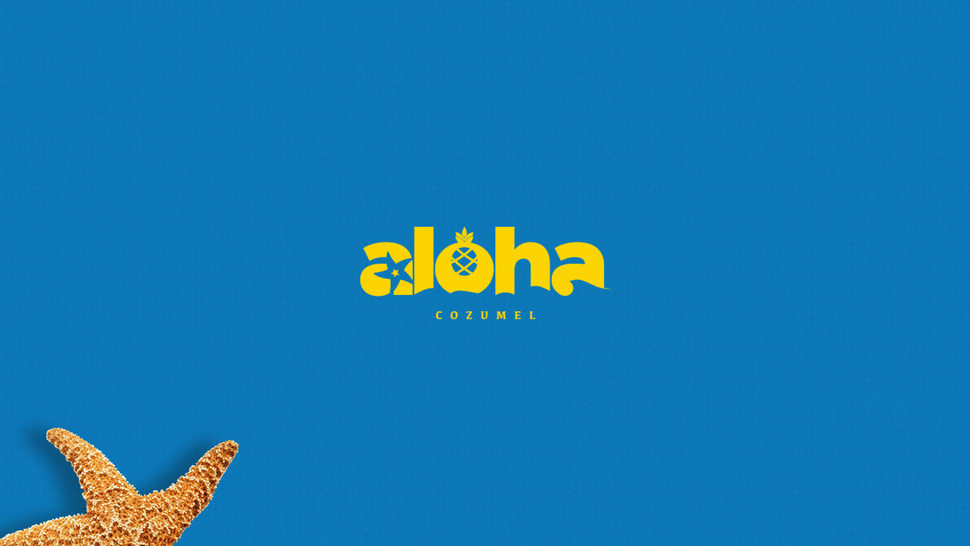
The Agave was taken as a representative image of this company, a blue agave graphic was chosen to crown the letters. This assumes a primary role in the brand, since it represents one of the greatest strengths of the company; the tequila.
Taking advantage of the location and similarity of this graphic element, the leaves of the agave and the rays of the sun intermingle, alluding to a Cozumeleño sunset.
Taking advantage of the location and similarity of this graphic element, the leaves of the agave and the rays of the sun intermingle, alluding to a Cozumeleño sunset.
Finally, it could be said that the typography rests on a line of Mayan fretwork.
This ideographic element is commonly found in the cultures of Latin America and these specifically symbolize the sea. Of course, the sea is an important symbol due to the geographic location of the island, which is why it was decided to make it part of the brand's identity.
This ideographic element is commonly found in the cultures of Latin America and these specifically symbolize the sea. Of course, the sea is an important symbol due to the geographic location of the island, which is why it was decided to make it part of the brand's identity.